AppLogs dashboard
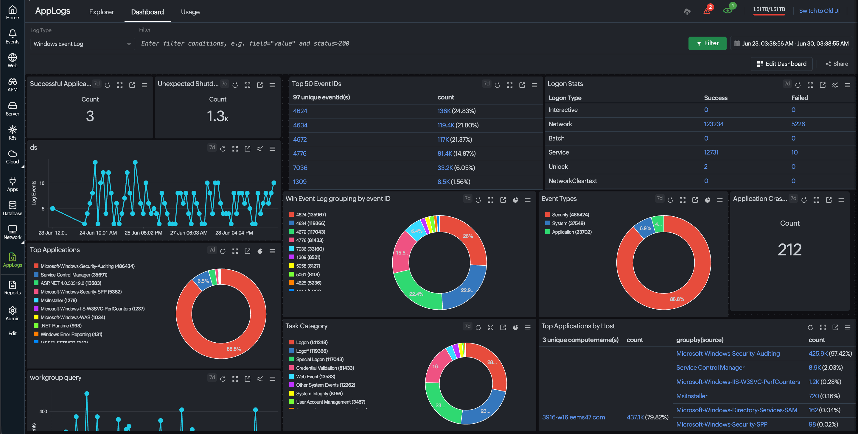
AppLogs dashboard in Site24x7 offers a user-friendly, real-time view of your log data all in one place.
Transforming raw logs into insightful charts and metrics helps IT teams monitor system behavior and troubleshoot issues faster. There are two types of dashboards to visualize your log data:
-
Default dashboard: When a default log type is added, a default dashboard is automatically generated with a preconfigured summary of key metrics, including event types, status codes, and trend charts specific to the log source.
-
Custom dashboard: A customizable dashboard that allows you to integrate AppLogs widgets from different log types and saved searches with drag-and-drop layout adjustments.
The instructions listed below are based on the new UI i.e., Switch to new UI view.
How to access the default dashboard
You can access log-specific visualization directly from the AppLogs search interface:
- Log in to Site24x7.
- In the left navigation panel, click the AppLogs icon
 .
. - Click the Dashboard tab.
- Select the Log Type from the drop-down menu (for example, Windows Event Log).
- Alternatively, you can go to Home > Dashboard > AppLogs Dashboard > Windows Event Log to view the default log type's dashboard.
How to access the custom dashboard
The custom dashboard consolidates critical data from every layer of your monitoring into a single, customizable interface.
You can create a personalized view of your log environment by creating a custom dashboard. To configure a custom dashboard, follow the steps below:
- Navigate to Home > Dashboard > Custom Dashboards tab.
- Click the Create New button in the top-right corner of the dashboard.
- You can add multiple widgets to create a customized dashboard that enhances visual reports, tracking and analysis.
How to add AppLogs widgets
By incorporating log widgets that emphasize your saved search, you can personalize your log monitoring experience. To add an AppLogs widget, follow the steps below:
- Follow the custom dashboard creation steps 1 through step 3 in the previous section.
- Once a new custom dashboard is added, a collection of widgets will pop up on the left panel.
- Under AppLogs, select any one of the AppLogs Widget types.
Type of query
The saved search query can be created in different formats, such as:
-
Count query: Returns a single numerical value. These are numerical queries that provide a count of occurrences within a dataset.
-
Aggregation query: Returns grouped or time-series data. These queries perform calculations like sum, average, or other aggregations across a specified set of data, allowing for a comprehensive view of trends and patterns.
- The count query supports the numerical widgets while other widgets support aggregation queries, based on the aggregation queries supported chart type changes such as data table, bar chart.
- In some cases, a user may not find the expected log type or saved search query while creating an AppLogs widget. This often occurs because the selected widget type is not supported for the saved search query.
Count query
A count query returns a single numerical value that represents the number of log entries that match the specified query conditions. It is used to measure the frequency of events or occurrences within a dataset.
These queries provide summarized numerical insights instead of detailed log entries, making them ideal for dashboard widgets that focus on quick metrics.
AppLogs Number Widget
The AppLogs Number Widget displays the output of a query as a single numerical value on the dashboard. It provides an at-a-glance view of key metrics obtained from your log data without requiring detailed charts or tables.
Sample queries
-
Calculate the number of error responses
The query below counts the number of log entries where the HTTP status code is 400 or higher, helping you track request and response error occurrences.logtype="Apache Access Logs" and status>=400 count
-
Calculate the average response size
The below query calculates the average response size returned by the server request, which helps monitor payload trends and bandwidth usage.logtype="Apache Access Logs" avg(responsesize)
-
Analyze request processing time
The below query returns the average, maximum, and minimum request processing time, helping you analyze and evaluate the application and identify latency issues.logtype="IIS Access Logs" avg(timetaken) max(timetaken) min(timetaken)
-
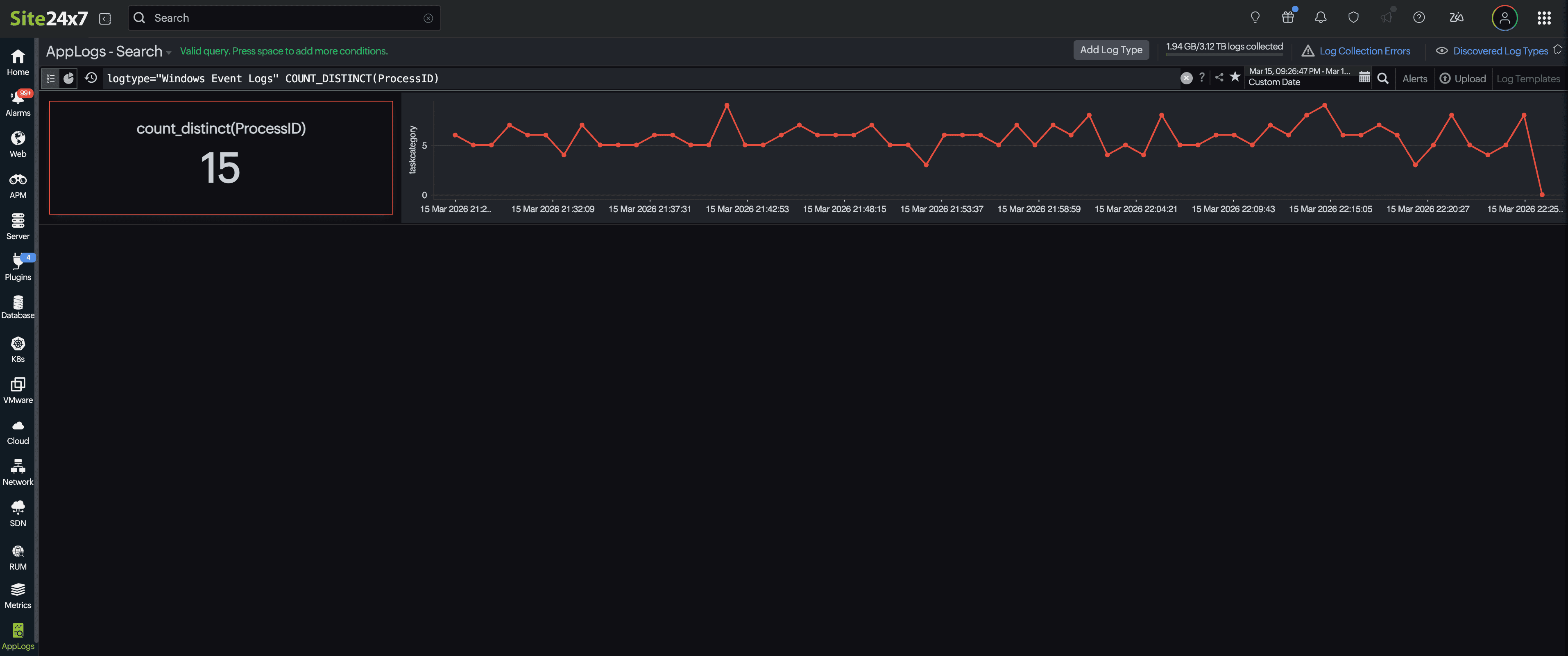
Count distinct process IDs
The below query calculates the number of unique process IDs present in Windows event logs that can help analyze process activity or identify unusual process patterns.logtype="Windows Event Logs" COUNT_DISTINCT(ProcessId)
Aggregation query
An aggregation query performs calculations on log data to summarize values across a dataset. It can produce grouped results or time-series data, enabling deeper analysis of log activity like bar, pie, and data table charts.
These queries are commonly used to monitor metrics such as response sizes, request latency, data transfer volume, and endpoint usage trends.
Aggregation queries can be used with the following AppLogs widgets:
AppLogs Graph Widget
To identify anomaly patterns at a glance, this widget enables you to visualize log data trends through dynamic charts like line chart, area charts, bar charts, and pie charts. The list of chart types supported by AppLogs Graph Widget is as follows:
-
Bar Chart: Make comparison charts by analyzing metrics across different time intervals.
-
Line Chart: Conduct trend analysis to monitor HTTP errors over time.
-
Area Chart: Track cumulative trends to monitor bandwidth consumption effectively.
-
Pie Chart: Conduct distribution analysis to present traffic distribution by URL.
Bar Chart
Bar charts compare values across different categories or time periods. They support several types of bar charts, each optimized for specific analytical scenarios.
1. Trend Bar Chart
A trend bar chart displays metrics across time slices using vertical bars. This makes it easy to compare values at different time intervals and identify trends at a glance.
Sample query:
logtype="IIS Access Logs" and statuscode>=400 timeslice 1h
This query retrieves IIS access logs with status codes 400 or higher, grouped into 1-hour time slices.
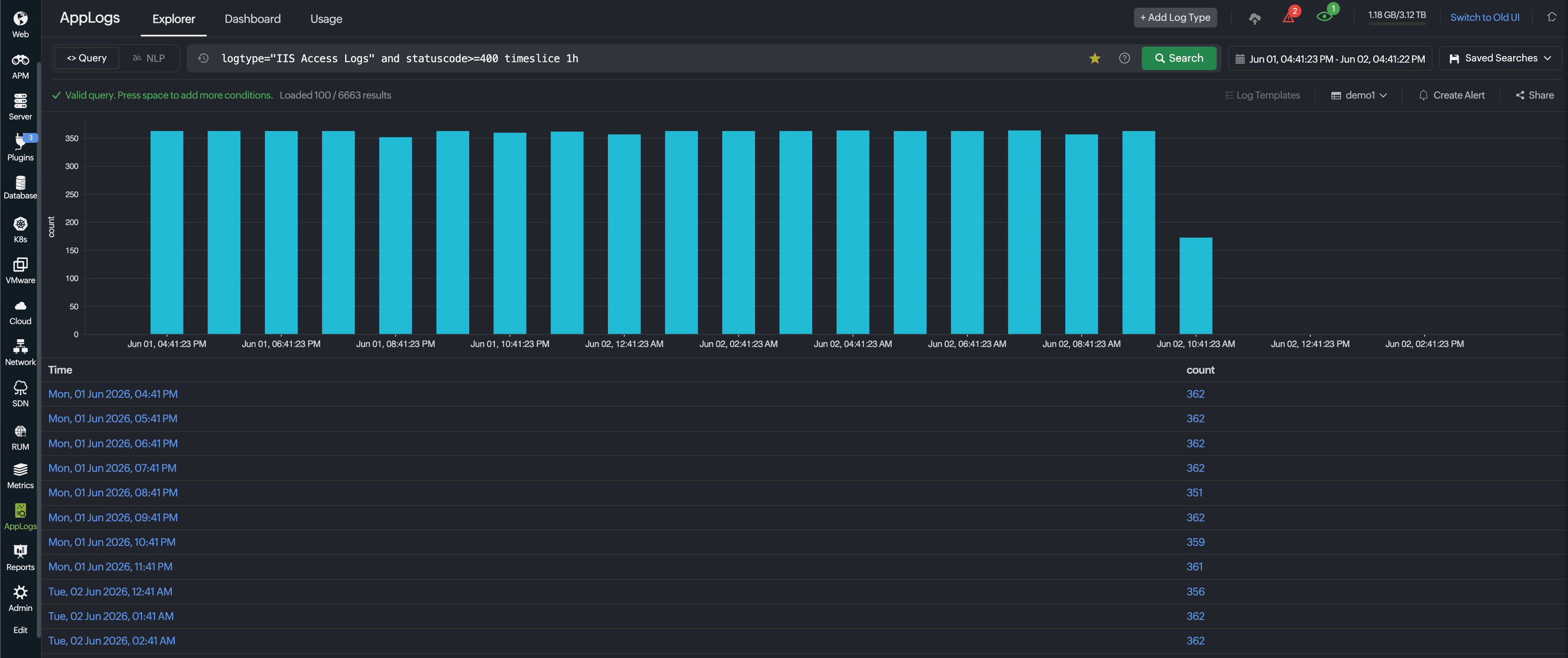
The resulting bar chart displays error counts for each hour, making it easy to identify when errors occur most frequently and track their progression throughout the monitoring period.
2. Stacked Bar Chart
A stacked bar chart displays multiple metrics within a single bar, with each segment representing a different value.
Sample query:
logtype="Apache Access Logs" avg(responsesize) groupby status timeslice 1h
This query analyzes Apache logs and groups response sizes by HTTP status code every hour.
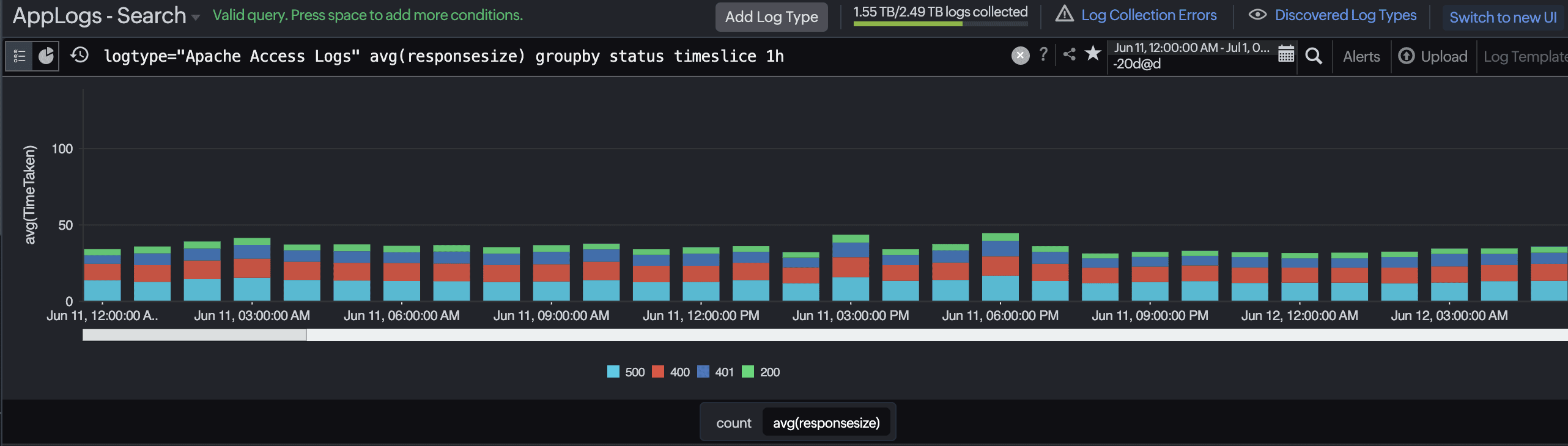
The stacked bar chart displays response sizes with each HTTP status (200, 300, 400, 500, etc.) represented as a separate segment within each bar. This helps identify which status codes correspond to larger or smaller response sizes.
3. Horizontal Bar Chart
A horizontal bar chart displays categories on the vertical axis with metric values extending horizontally.
Sample query:
logtype="IIS Access Logs" and statuscode>=400 avg(timetaken) groupby stemuri limit 50
This query examines IIS access logs for failed requests (status 400+) and calculates the average response time for each request URI.
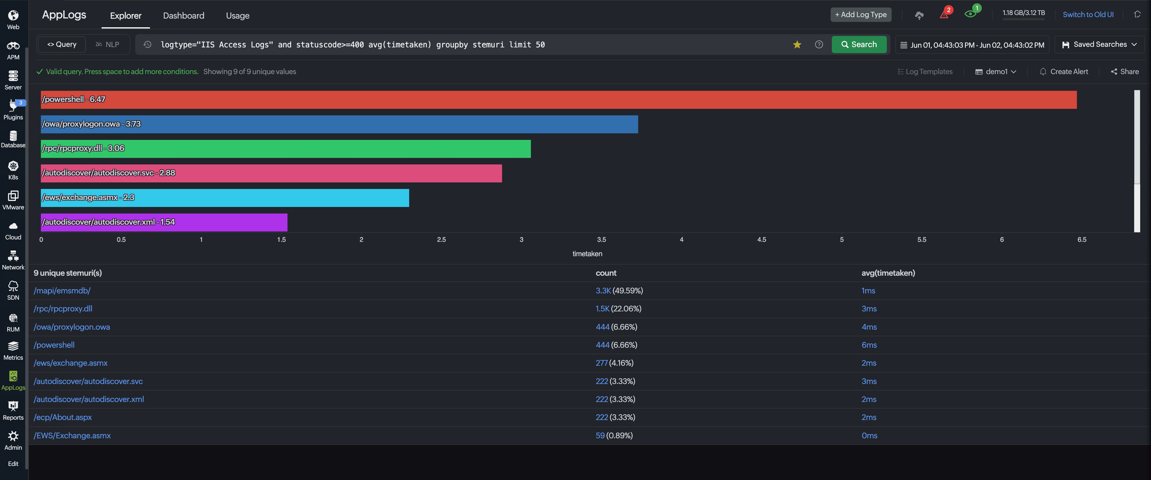
The horizontal bar chart displays the top 50 URIs with the longest response times, making it easy to identify which specific resources are causing performance issues.
4. Level Bar Chart
A level bar chart displays severity or intensity levels across categories.
Sample query:
logtype="Zoom Logs" and (event="meeting.alert" or event="webinar.alert")
This query counts Zoom log events for meeting and webinar alerts.

The level bar chart shows the frequency of each alert type, allowing you to monitor the distribution of alerts and identify the most common types. This is useful for understanding the health of the communication platform and identifying recurring issues.
5. Clustered Bar Chart
A clustered bar chart displays multiple metrics side-by-side for easy comparison.
Sample query:
logtype="IIS Access Logs" avg(responsesize) max(responsesize) groupby StemURI
This query analyzes IIS access logs and calculates both average and maximum response sizes grouped by request URI.
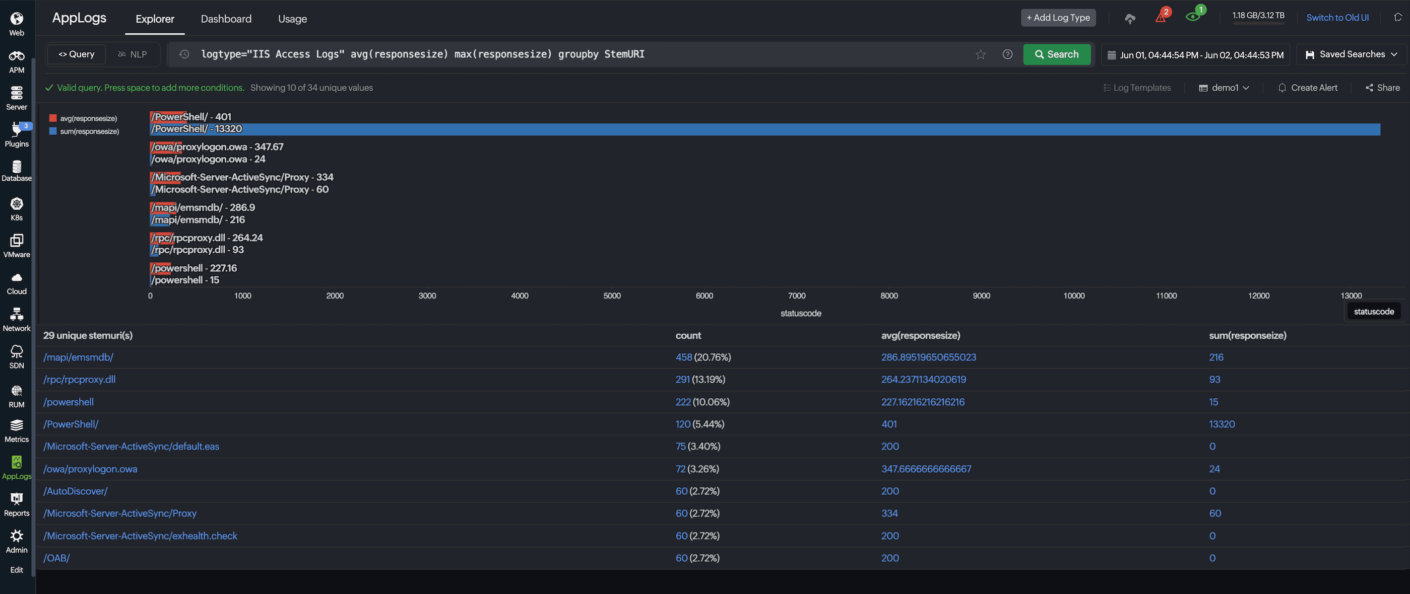
The clustered bar chart displays both metrics side-by-side for each URI, allowing you to compare average versus maximum response sizes simultaneously and identify which endpoints have the largest response payloads.
Line Chart
Line charts are ideal for displaying trends and patterns in your log data over time. They clearly show how metrics change over time, making it easy to identify spikes, dips, and overall trends.
1. Basic Line Chart
A simple line chart helps you visualize a single metric across time intervals. This is the most straightforward way to track trends in your log data.
Sample query:
logtype="IIS Access Logs" and statuscode>=400
This query filters IIS access logs to display only requests with status codes 400 or higher.
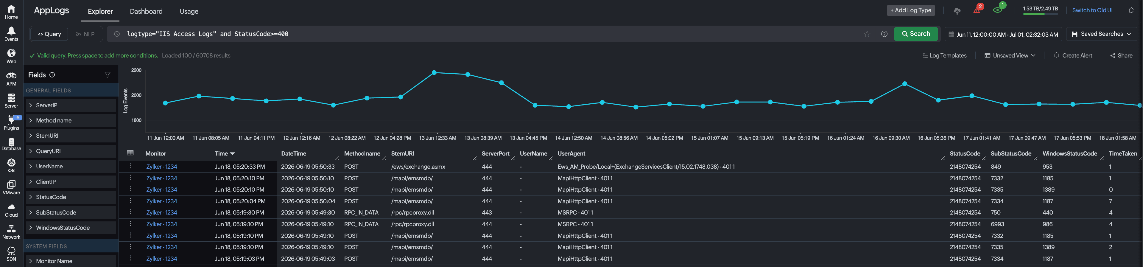
The resulting line chart shows the frequency of errors over time, helping you identify error trends and potential issues in your application.
2. Line Chart with Count and Aggregation
An advanced line chart displays multiple aggregated metrics simultaneously, including average and sum values. The time slice parameter groups data into intervals for clearer visualization.
Sample query:
logtype="Apache Access Logs" avg(responsesize) max(responsesize) timeslice 15m
This query analyzes Apache access logs and calculates the average and maximum response size, along with the request count for each 15-minute interval.
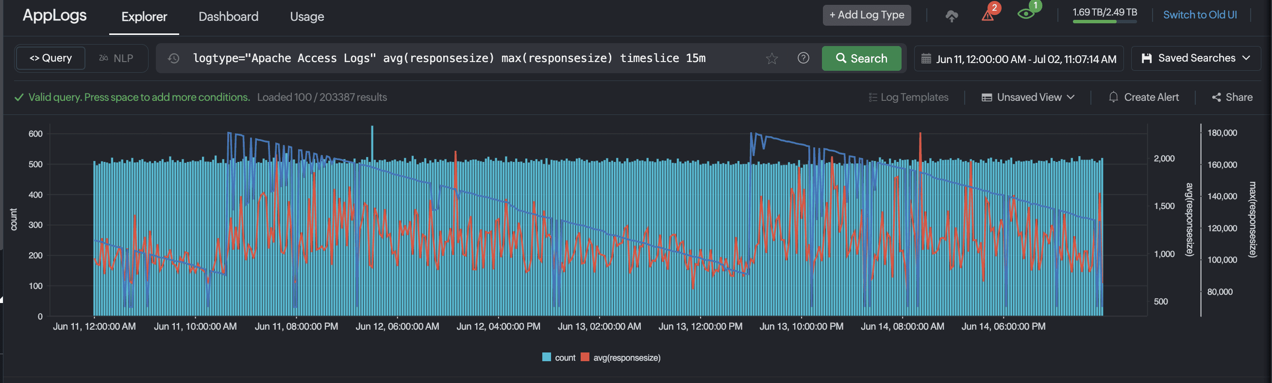
The line chart displays both metrics, allowing you to monitor response size trends and identify when your application is serving larger or smaller payloads. This helps optimize bandwidth usage and performance.
Area Chart
Area charts are similar to line charts but are useful for emphasizing the magnitude of change over time and showing cumulative totals.
1. Area Chart with Average Metrics
An area chart visualizes average values across time slices, providing a clear view of metric magnitude changes. This is ideal for monitoring trends in aggregated metrics.
Sample query:
logtype="Apache Access Logs" avg(bytessent) timeslice 15m
This query examines the log data and calculates the average number of bytes sent for each 15-minute period.
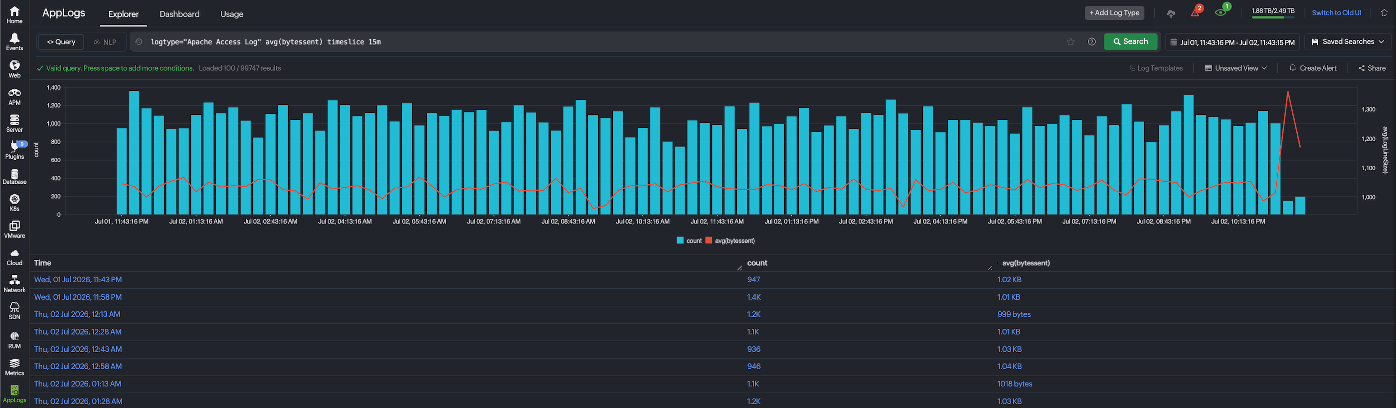
The resulting area chart visualizes bandwidth usage trends, with the filled area making it easy to see when traffic was highest and how it fluctuates throughout the day. This helps identify peak usage periods and potential bottlenecks.
Pie Chart
Pie charts excel at displaying the distribution of a metric across categories, showing the proportion of each segment relative to the whole.
1. Pie Chart with Group By
A pie chart helps you visualize the distribution of data across categories. Each segment represents a portion of the total, with the segment size proportional to its value.
Sample query:
logtype="IIS Access Logs" groupby requesturi limit 20
This query groups IIS access log requests by URI and limits results to the top 20 resources.
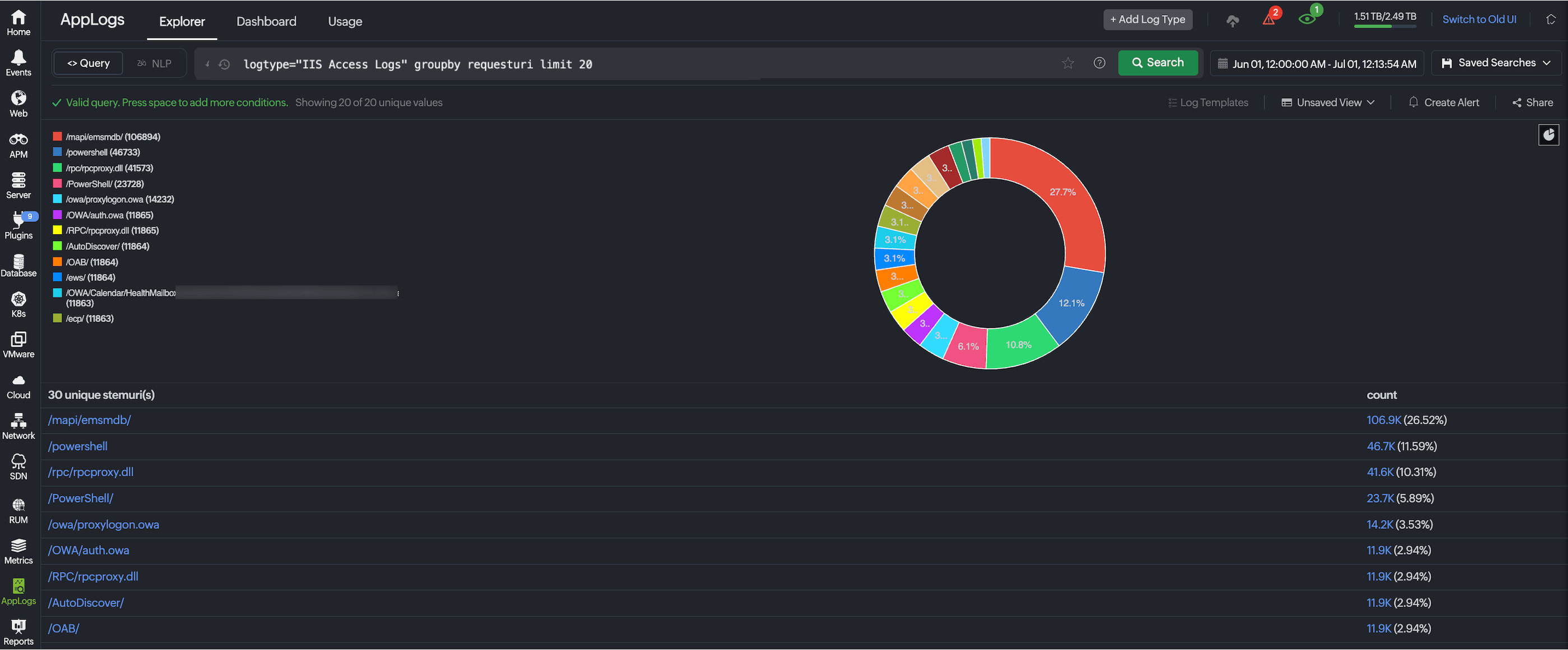
The pie chart displays each URI as a segment, with the size of each segment proportional to the number of requests it received. This visualization helps identify which pages or resources receive the most traffic and which are rarely accessed, informing optimization decisions.
AppLogs Table Widget
The AppLogs Table Widget displays log data in a structured table format, allowing you to examine individual log events with precision. The table widget presents your log data as rows and columns, with each row representing a single log entry and columns representing specific fields or attributes from your logs.
This widget is ideal for detailed troubleshooting and understanding specific log entries that match your search criteria.
Sample query:
logtype="Java Application Logs" and loglevel contains "error" | include(exceptionmessage)
This query filters Java application logs for entries containing the word error in their log data. The include(exceptionmessage) specifies that only the exception message field should be displayed in the table, along with the standard log fields.

This lets you quickly scan all errors and their respective exception messages without cluttering the view with irrelevant fields.
Sample query:
logtype="Windows Event Logs" groupby type,level,source
This query retrieves all Windows event logs and groups them by three dimensions: event type, severity level, and source.

The resulting table displays each unique combination of these three fields with a count of how many log entries match that combination, enabling better prioritization of troubleshooting efforts.
AppLogs KPI Widget
This widget displays key performance indicators (KPIs) extracted from your log data, and presents both current values and period-over-period comparisons, letting you track essential metrics and compare their values over different time periods.
This widget helps provide quick visibility into metrics such as average response time, total data transferred, or other aggregated performance indicators on the dashboard.
Sample query:
logtype="IIS Access Logs" avg(TimeTaken) | before 1d
This query calculates the average response time taken for all the IIS access log entries, and compares it against the value from one day ago.
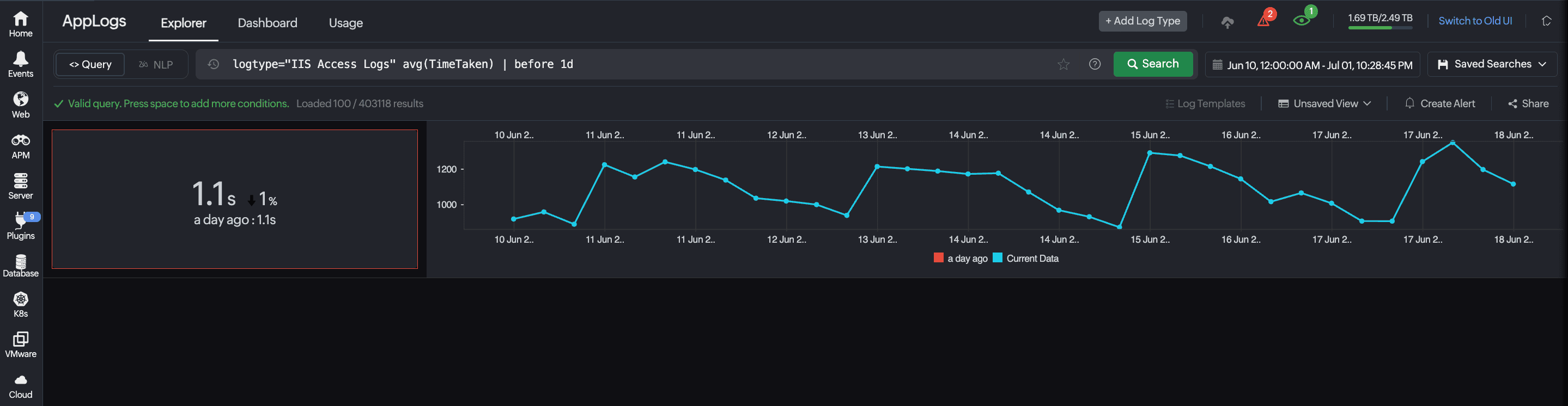
This comparison reveals whether response times are improving or degrading relative to the previous day.
AppLogs Alerts Status Widget
The AppLogs Alerts Status Widget provides a real-time visual indicator of the current alert state for your log-based alert rules, displaying statuses such as Critical, Trouble, or Down at a glance.
In this example, you can view all the alert queries and their monitor statuses in one quick view. You can also switch between honeycomb and grid view.
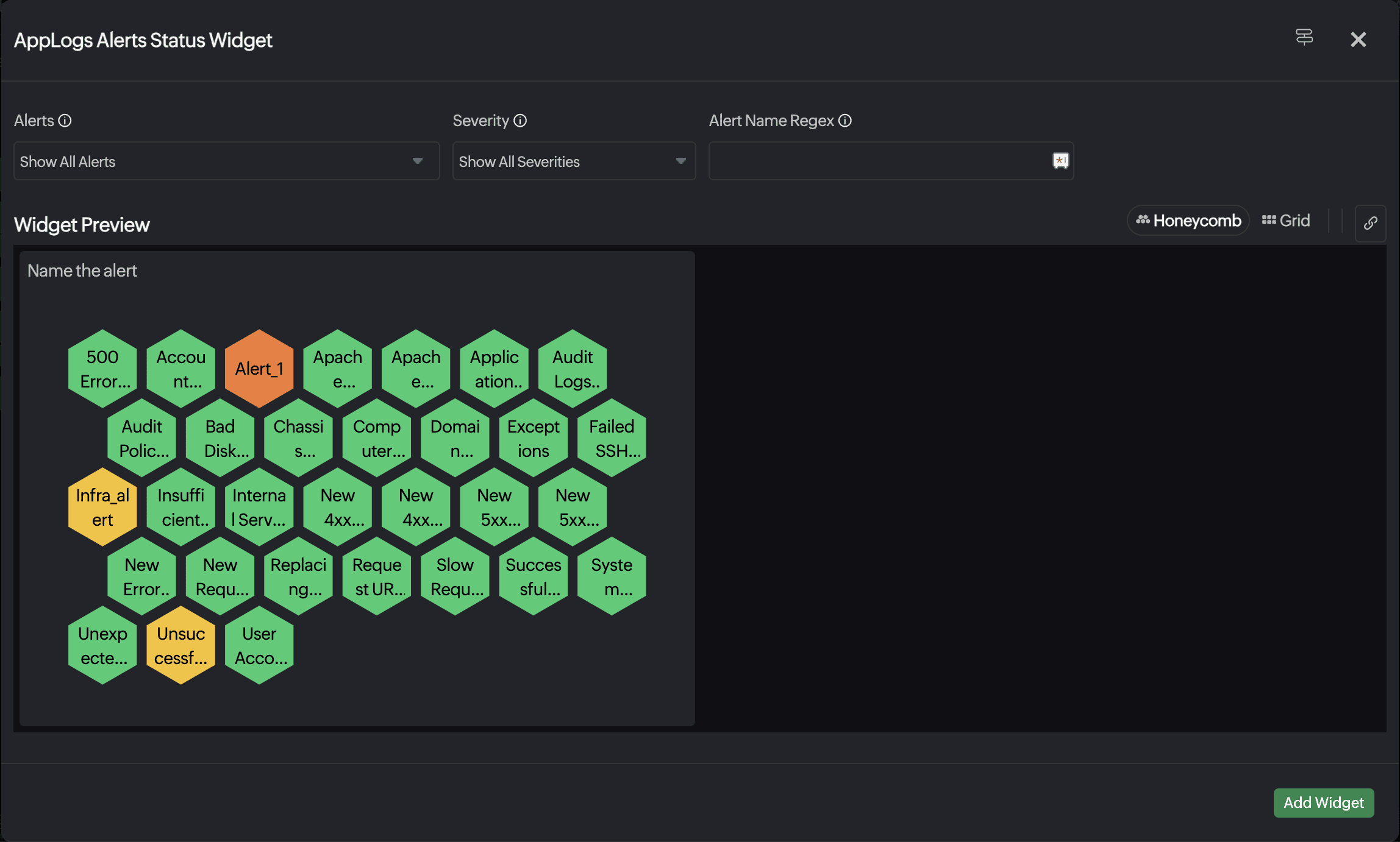
Unlike other AppLogs widgets, the Alerts Status Widget does not require a count or aggregation query. It operates independently of query-based inputs, functioning purely as a status indicator that reflects the live state of your configured log alert rules.