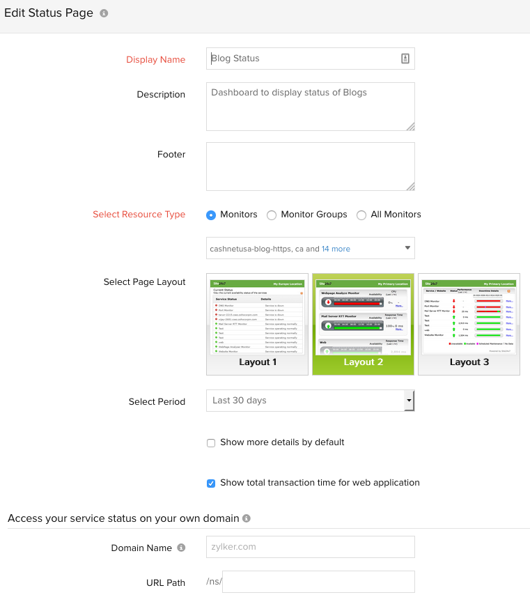
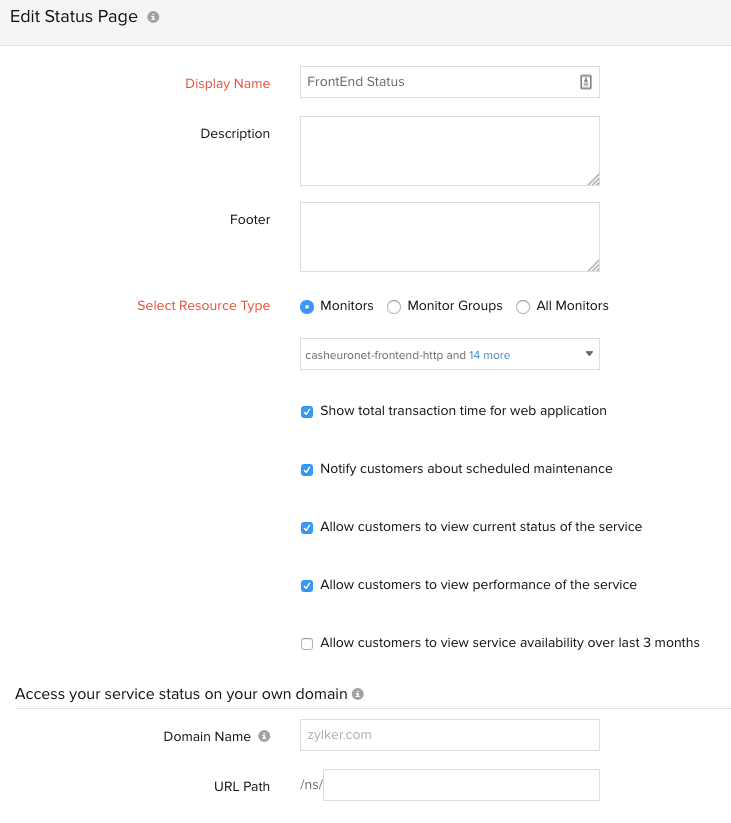
I like the new layout of the status pages however, there are a few things that would make them even better...
1.) Custom logo per page. Some companies have different departments/sub companies and it would be nice to be able to create branding to match the type or checks or business sector they will be representing.
2.) For the Incident History, it would be better to have those in smaller blocks of color with the date and number of issues if there are any:
Old setup:

New Setup:

1.) Custom logo per page. Some companies have different departments/sub companies and it would be nice to be able to create branding to match the type or checks or business sector they will be representing.
2.) For the Incident History, it would be better to have those in smaller blocks of color with the date and number of issues if there are any:
- Red = Services were down -> Click to see details.
- Green = All services are Operating Normally
Old setup:

New Setup:

Like (2)
Reply
Replies (1)
Hi framirez,
Thanks for your feedback. We would surely take this into consideration during our next round of enhancements on status pages.
Thillai.
Like (0)
Reply