As a web developer, you’ll inevitably encounter rem and em units in CSS. While they may seem similar, these units are distinct and serve different purposes.
Understanding how to use these font size units goes beyond theoretical knowledge. Once you have a solid grasp of the concept and know how to implement each unit effectively, you can take full advantage of CSS’ fantastic flexibility.
The rem and em units in CSS stem from a necessity for flexibility and adaptability in web design. Their inception goes back to the early days of CSS. The em unit has been part of the styling language since its outset, and rem was introduced later to overcome specific challenges em posed.
rem stands for root em, where the size of 1 rem is equivalent to the font size of the root element, usually the HTML element. This unit offers a predictable method to establish a foundational font size. Other dimensions within the design can derive from this font size, like in the code below, where the paragraph’s font sizes are multiples of the html element’s 16-pixel font size:
html {
  font-size: 16px;
}

p {
  font-size: 1rem; /* equals 16px */
  font-size: 1.5rem; /* equals 24px */
  font-size: 2rem; /* equals 32px */
}
On the other hand, em is a more traditional unit in CSS. Its name derives from the width of the letter M in historical typography. The em unit is relative to its nearest parent element’s font size, making it a dynamic and flexible unit, particularly useful for creating scalable and modular designs.
In the example below, the section tag has a font size of 20 pixels, so the font sizes in that section’s paragraph are multiples of 20 pixels:
section {
  font-size: 20px;
}

p {
  font-size: 1em; /* equals 20px */
  font-size: 1.5em; /* equals 30px */
  font-size: 2em; /* equals 40px */
}
Both units are indispensable for creating designs that adapt gracefully to varying screen sizes and user preferences. Their relative nature enables you to create layouts that scale proportionally, ensuring a consistent user experience across various devices and viewing environments.
The units are also pivotal to promoting maintainable and clean code. You can alter a few foundational values to adjust styles globally.
The em unit offers a dynamic sizing mechanism, as its volume is always linked to the parent element’s font size. This relative nature is particularly useful in scenarios that require proportional scaling among elements.
Let’s explore some practical examples of using em.
The h1 and p elements scale proportionally based on the html element’s font size in the example below. This approach ensures that typography remains consistent and legible across various screen sizes.
html {
  font-size: 20px;
}

h1 {
  font-size: 2em; /* equals 40px */
}

p {
  font-size: 1em; /* equals 20px */
}
Here, the button element’s padding and margin use em, adapting dynamically to the div element’s font size. This approach maintains cohesive spacing within the layout:
div {
  font-size: 16px;
}

button {
  padding: 1em; /* equals 16px */
  margin: 0.5em; /* equals 8px */
}
In the code below, the box element’s dimensions scale according to the container element’s font size. This approach ensures that the box maintains shape and proportionality across different viewing environments:
.container {
  font-size: 18px;
}

.box {
  width: 10em; /* equals 180px */
  height: 10em; /* equals 180px */
}
The em unit promotes modular design, encouraging elements to adapt gracefully to their styling context. This adaptability is especially helpful in complex layouts or nested structures, where elements need to maintain visual harmony at various nesting levels.
The rem unit’s value in CSS is anchored to the root element’s font size. It’s your go-to if you need consistent sizing across various elements.
Using rem units is beneficial for creating responsive designs on web pages that incorporate media queries. These queries adapt styles based on device characteristics. In this example, when the viewport width reaches 480 pixels or broader (equivalent to 30 rem), the font-size of the body element scales up, ensuring legibility across varying screen sizes:
@media (min-width: 30rem) { /* equals 480px */
  body {
	font-size: 1.2rem;
  }
}
rem units also ensure layouts adapt smoothly to user preferences for better accessibility. They’re essential for a consistent and inclusive user experience across various devices and settings:
html {
  font-size: 18px; /* Base size */
}

.container {
  width: 20rem; /* equals 360px */
  padding: 1rem; /* equals 18px */
}

button {
  font-size: 1.25rem; /* equals 22.5px */
}
/* When user adjusts root font-size, all rem-based dimensions adapt */
@media (min-width: 768px) {
  html {
	font-size: 20px; /* New base size, button font-size now equals 25px */
  }
}
In this example, the layout and interface elements (like buttons) adjust their dimensions as the root font size changes. Here, rem units offer a versatile and efficient way to create responsive and accessible designs.
Using rem units for margins and padding ensures unified spacing regardless of the nesting or context. This method enhances the layout’s visual consistency and predictability:
html {
  font-size: 16px;
}
.section {
  margin: 2rem; /* equals 32px */
  padding: 1rem; /* equals 16px */
}

.button {
  margin: 0.5rem; /* equals 8px */
  padding: 0.75rem; /* equals 12px */
}

.header, .footer {
  padding: 1.5rem; /* equals 24px */
}
In this example, elements like .button, .header, and .footer are spaced based on rem units. This approach ensures they retain proportional spacing even if the root font size changes, making the design more manageable and scalable.
rem and em units each have unique advantages. While rem provides stable, predictable sizing based on the root element, em offers relative sizing based on the parent element, promoting adaptable designs.
| Feature | REM Units |
EM Units |
|---|---|---|
| Basis of size calculation | Based on the root element’s font size | Based on the parent element’s font size |
| Flexibility in design | Provides stable and predictable sizing but is less flexible | Promotes adaptable, flexible designs and relative sizing |
| Nesting behavior | Size doesn’t compound with nesting—remains constant relative to root | Compounds with nesting, and each nested element scales based on its parent’s size |
| Responsive typography | Ensures consistent size across different elements | Allows font size and line height to adapt to parent elements |
| Accessibility | Ensures uniformity and consistency, especially useful in layouts and spacing | Adapts to user preferences in scaling and allows for proportional adjustments in complex layouts |
| Advantages | Better for consistent sizing across elements, ideal for base sizing in layouts | Better for scaling elements in relation to their parent, ideal for adaptable components |
Using rem for the header height ensures a fixed size across the website, providing a stable layout structure:
html {
  font-size: 16px;
}

.header {
  height: 4rem; /* 64px */
}
In the above example, since all parts of the site use the root html element, headers will always be a multiple of its 16-pixel size.
em enables padding list items to adapt based on their font size, promoting a flexible, interactive design:
.list-item {
  font-size: 1em; /* Inherits from parent */
  padding: 0.5em; /* Adapts with font-size */
}
In this example, the list item’s padding size relates directly to its font size. This functionality lets you dynamically adjust various layout elements based on the font size, including margins, borders, paddings, and most other CSS properties.
When writing CSS, you don’t need to commit to using only rem or em. They complement one another well, each serving an essential purpose in stylesheets like the one below:
html {
  font-size: 16px;
}

h1 {
  font-size: 2rem; /* 32px */
}
p {
  font-size: 1em; /* Inherits from parent */
  line-height: 1.5em; /* Relative to its own font-size */
}
In this example, using rem for h1 ensures a consistent size, while using em in p allows the font-size and line-height to adapt to their parent elements. Here, em and rem work together for more controlled, responsive typography.
One of the most important distinctions between rem and em units is how they handle nesting. Nested em elements have a compounding font size, which increases based on the parent element’s font size.
Let’s take a look at a case where you wouldn’t want to use em units due to their compounding font sizes. Consider the following example:
<!DOCTYPE html>
<html lang="en">
<head>
  <meta charset="UTF-8">
  <meta name="viewport" content="width=device-width, initial-scale=1.0">
 <style>
	.container {
  	font-size: 16px;
	}
	.parent {
  	font-size: 1em; /* 16px */
	}
	.child {
  	font-size: 2em; /* Expected: 32px, Actual: 32px */
	}
	.grandchild {
  	font-size: 2em; /* Expected: 32px, Actual: 64px */
	}
	.great-grandchild {
  	font-size: 2em; /* Expected: 32px, Actual: 128px */
	}
  </style>
<title>Font Size Compounding Example</title>
</head>
<body>
  <div class="container">
	<div class="parent">
  	Parent
    	<div class="child">
       	Child: Expected - 32px, Actual: 32px
        	<div class="grandchild">
          	Grandchild - Expected: 32px, Actual: 64px
            	<div class="great-grandchild">
              	Great Grandchild - Expected: 32px, Actual: 128px
            	</div>
            	</div>
            	</div>
            	</div>
	</div>
</body>
</html>
In this code, the .child, .grandchild, and .great-grandchild classes use em units. They inherit the font-size from their parent, creating a compounding effect. The font size doubles with each parent class, as the following image displays:
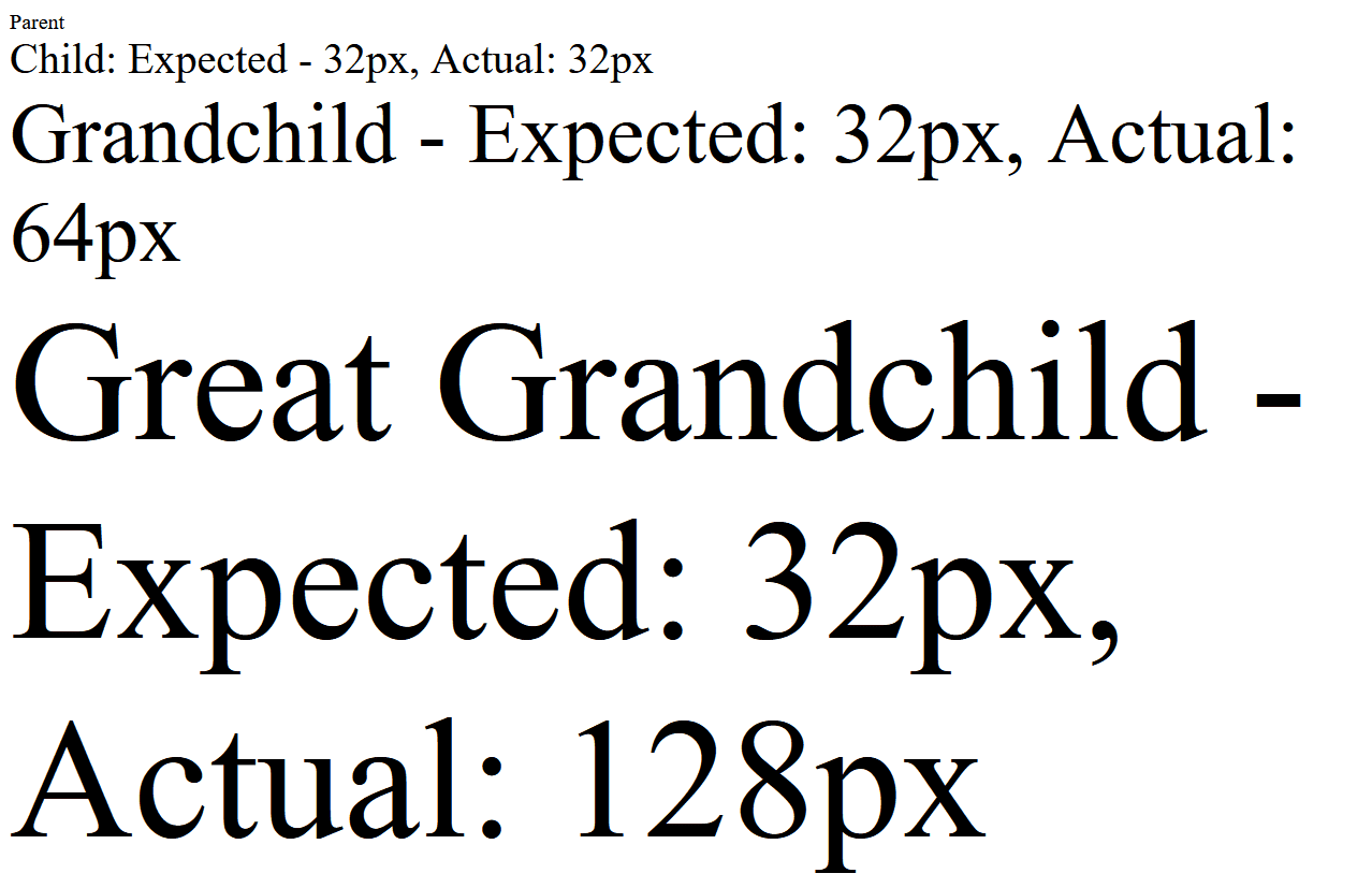 Fig. 1: Nested classes with increasing font sizes
This behavior is often undesirable, so rem units are specifically designed to address this issue. Unlike em units, rem units don’t compound when nested. This highlights a clear use case where you’d want to use em instead of em units.
Check out the same code sample below, but using rem units instead:
<!DOCTYPE html>
<html lang="en">
<head>
  <meta charset="UTF-8">
  <meta name="viewport" content="width=device-width, initial-scale=1.0">
 <style>
		html {
  	font-size: 16px;
	}
	.container {
  	font-size: 1rem; /* 16px */
	}
	.child {
  	font-size: 2rem; /* Expected: 32px, Actual: 32px */
	}
	.grandchild {
  	font-size: 2rem; /* Expected: 32px, Actual: 32px */
	}
	.great-grandchild {
  	font-size: 2rem; /* Expected: 32px, Actual: 32px */
	}
  </style>
  <title>Font Size Consistency Example</title></head>
<body>
<div class="container">
	<div class="parent">
  	Parent
    	<div class="child">
      	Child - Expected: 32px, Actual: 32px
        	<div class="grandchild">
            	<div class="great-grandchild">
              	Great Grandchild - Expected: 32px, Actual: 32px
            	</div>
            	</div>
            	</div>
            	</div>
  </div>
</body>
</html>
As the image below illustrates, the output now has the expected font sizes:
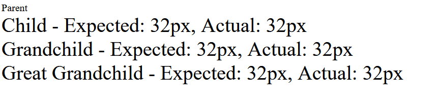 Fig. 2: Nested classes with consistent font sizes
Navigating the intricacies of rem and em units in CSS can be tricky. Below is a breakdown of common challenges and how to mitigate them:
Adhering to these guidelines can help you use rem and em units effectively in your projects, ensuring cleaner, more maintainable code.
rem units are grounded in the root element’s font size. They offer stability and consistency, making them ideal for global styling and responsive layouts. In contrast, em units provide flexibility and adaptability relative to their parent element’s font size, proving invaluable for creating scalable and modular designs.
The key takeaway is that these units complement—rather than compete with—each other. They work harmoniously to create designs that respond gracefully to various screen sizes, user preferences, and styling contexts.
By mastering the use of rem and em units, you can enhance your designs’ consistency and responsiveness while writing elegant and manageable code. Experiment with rem and em units in your CSS projects and leverage their unique strengths to create more responsive and user-friendly designs.
You can also explore more developer resources on Site24x7.
Site24x7's Web Application Monitoring (Real Browser Monitoring) loads your pages in real browsers like Chrome, Firefox, and Safari from 130+ global locations, letting you verify that your CSS layouts using rem or em units render consistently across different environments.
Yes, Site24x7 tracks Core Web Vitals including Cumulative Layout Shift (CLS). If inconsistent use of rem or em causes unexpected layout shifts, Site24x7 will flag elevated CLS scores so you can pinpoint and fix the issue.
Site24x7 measures page load times, render-blocking resources, and overall performance metrics. Large or inefficient CSS files can impact load speed, and Site24x7 helps identify these bottlenecks through detailed waterfall charts and performance breakdowns.