by Fernando
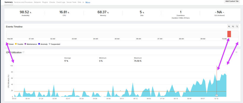
Currently, the Events Timeline chart is not aligned with the remaining charts on the monitor page. Even though there are some lines on the CPU chart, when there are many such events, it's hard to correlate them without mousing over to read about them. If the chart had the same width of the other ones, it would be easy to correlate things visually.
So, instead of this:
we could have this:
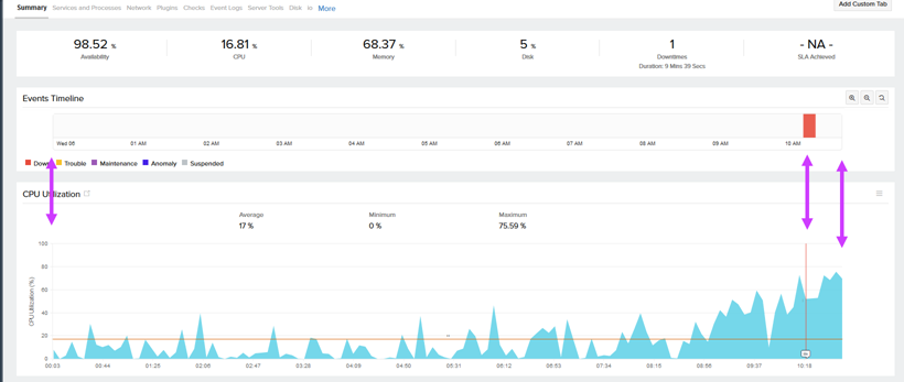
It's not a major issue, just a minor visual improvement.
Like (1)
Reply
Replies (1)
Thanks for your detailed post. We would consider this while working on any related tasks.
Like (0)
Reply